Logo
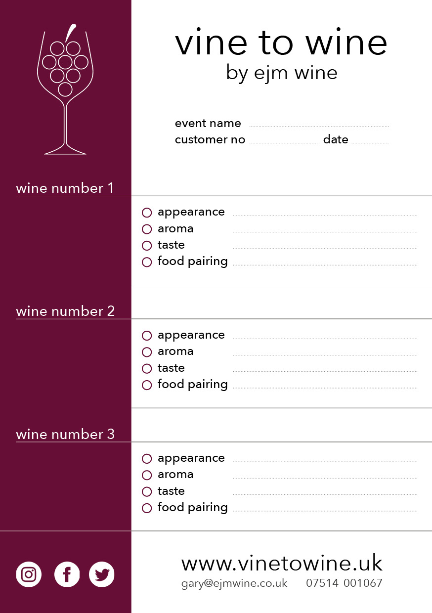
Wine tasting sheet front
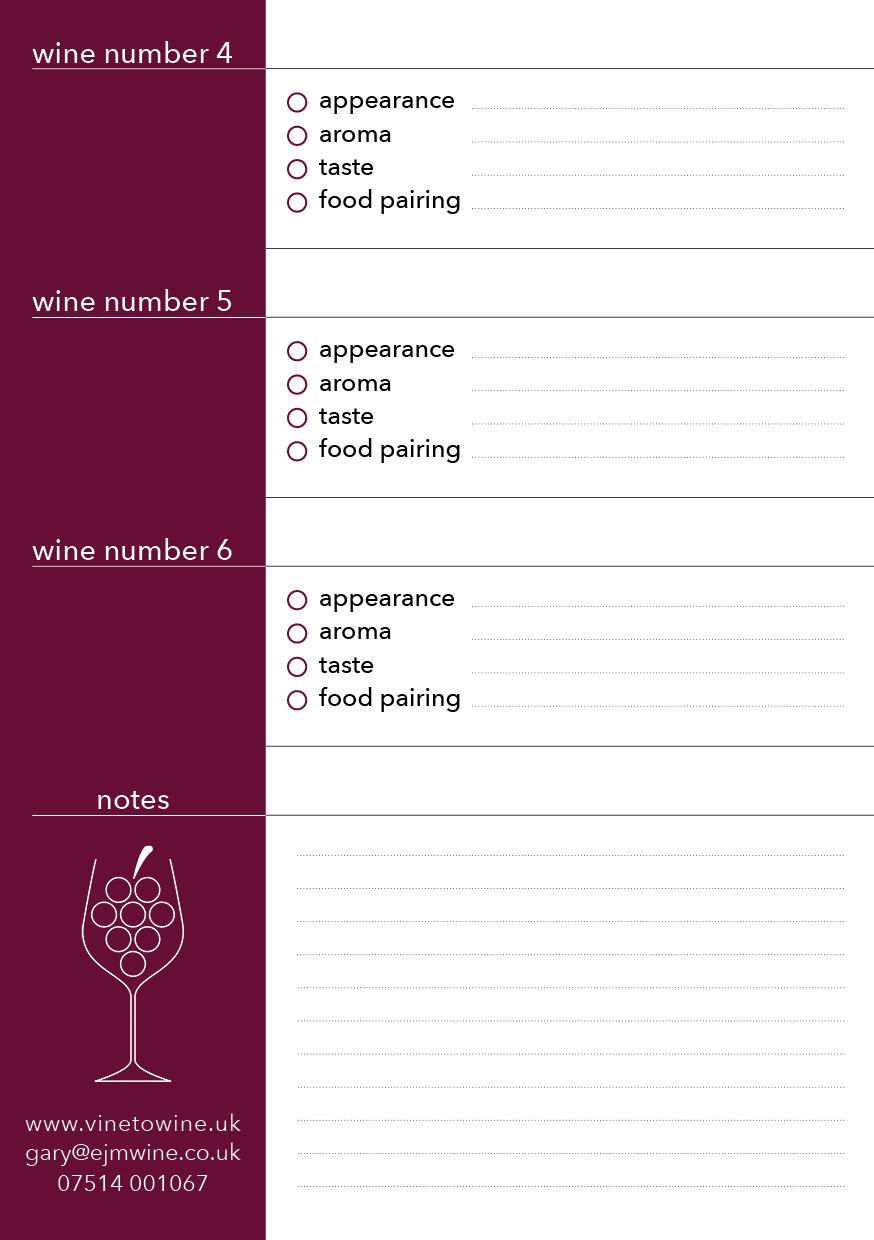
Wine tasting sheet back
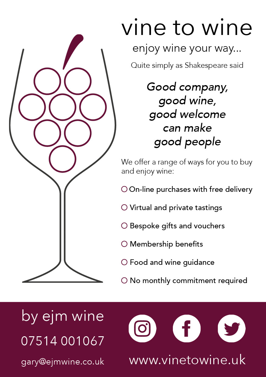
Flyer
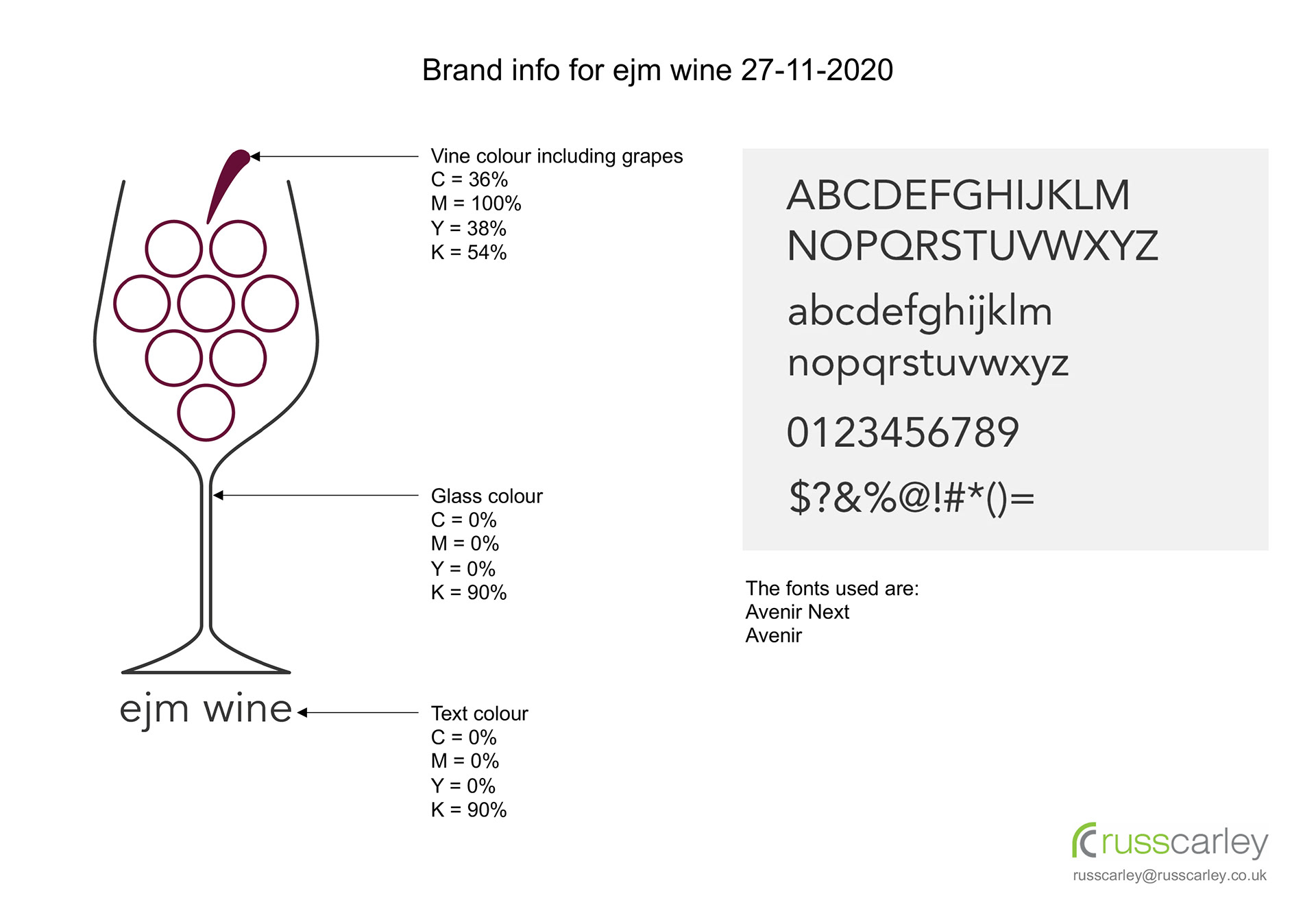
Branding document
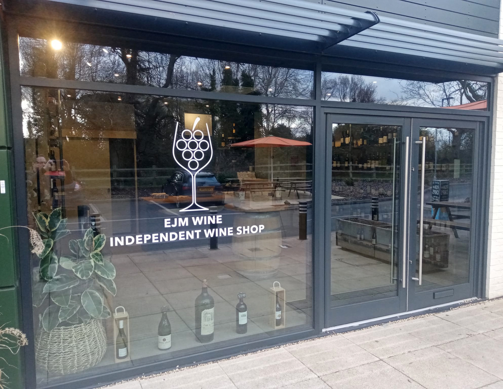
Logo on glass front to shop
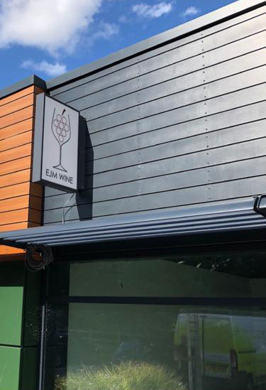
Logo on external signage
EJM Wine required a logo that would encapsulate the company motto "vine to wine, enjoy wine your way". This logo was then used on branding such as wine tasting sheets and flyers along with the external signage to their shop. A brand info document was produced so that any future branding can follow the same fonts and colours.
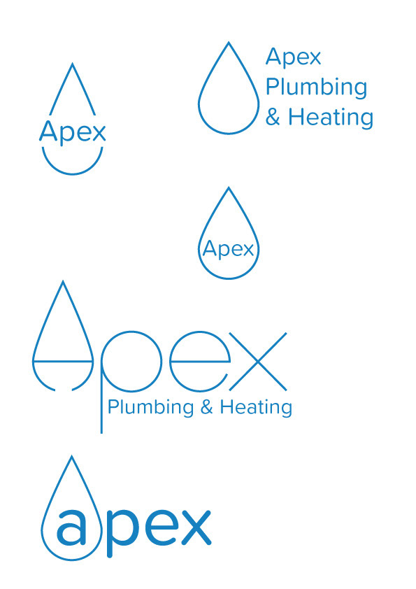
Initial concepts
Initial concepts

Initial concepts
Refinement of chosen style
Refinement of chosen style with text added
Refinement of chosen style deciding on the highlight in the water in the a

The final design
This logo was designed for a plumbing company who wanted to convey their modern and professional approach to their business. The images show the progress from initial concepts to refinement of the chosen style and the final design. The logo was then used as branding on their company van along with business cards.
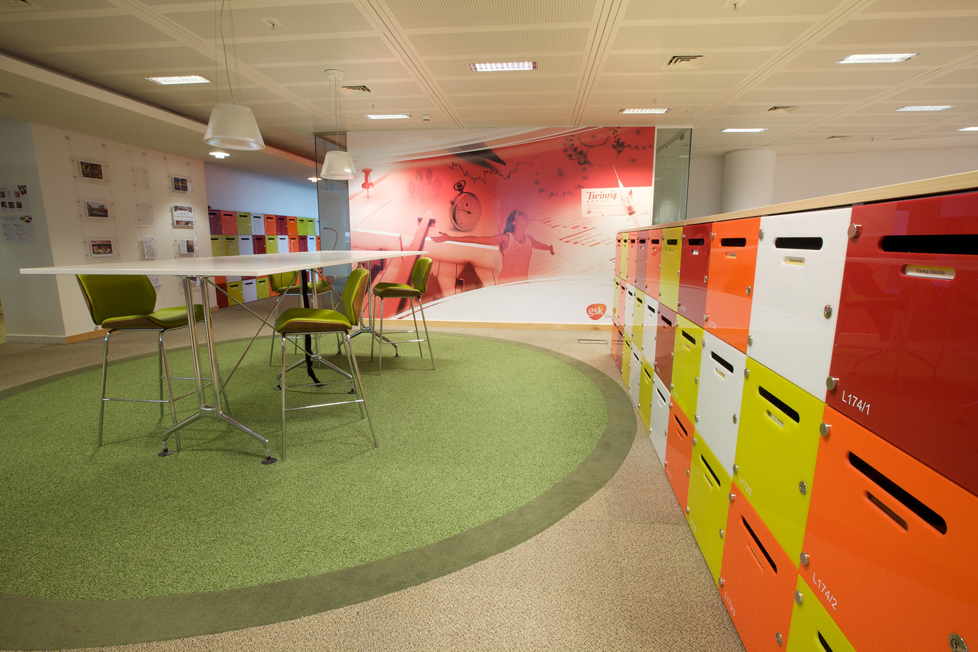
Large wall graphic in breakout and locker space
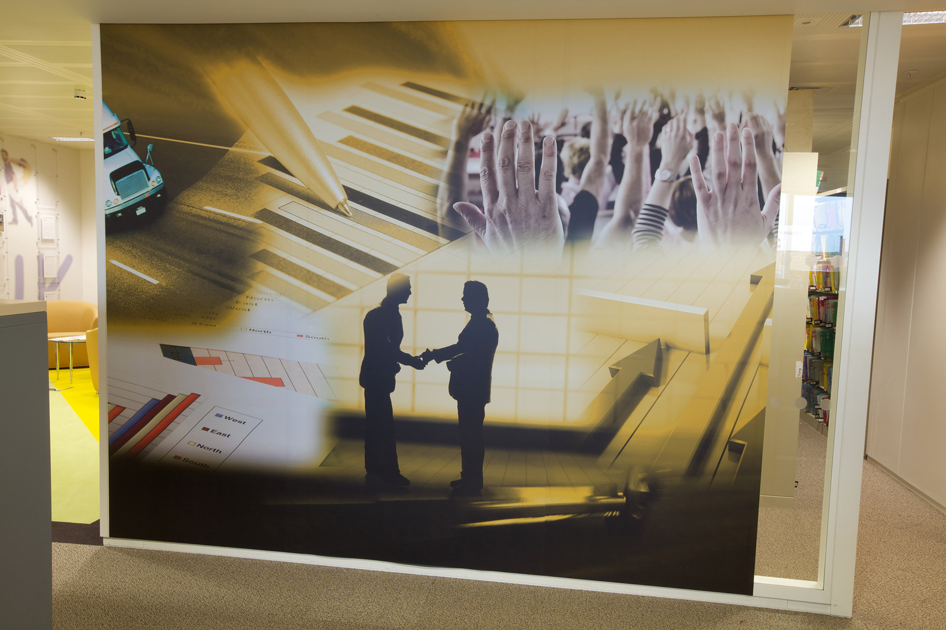
Wall graphic used on partition wall
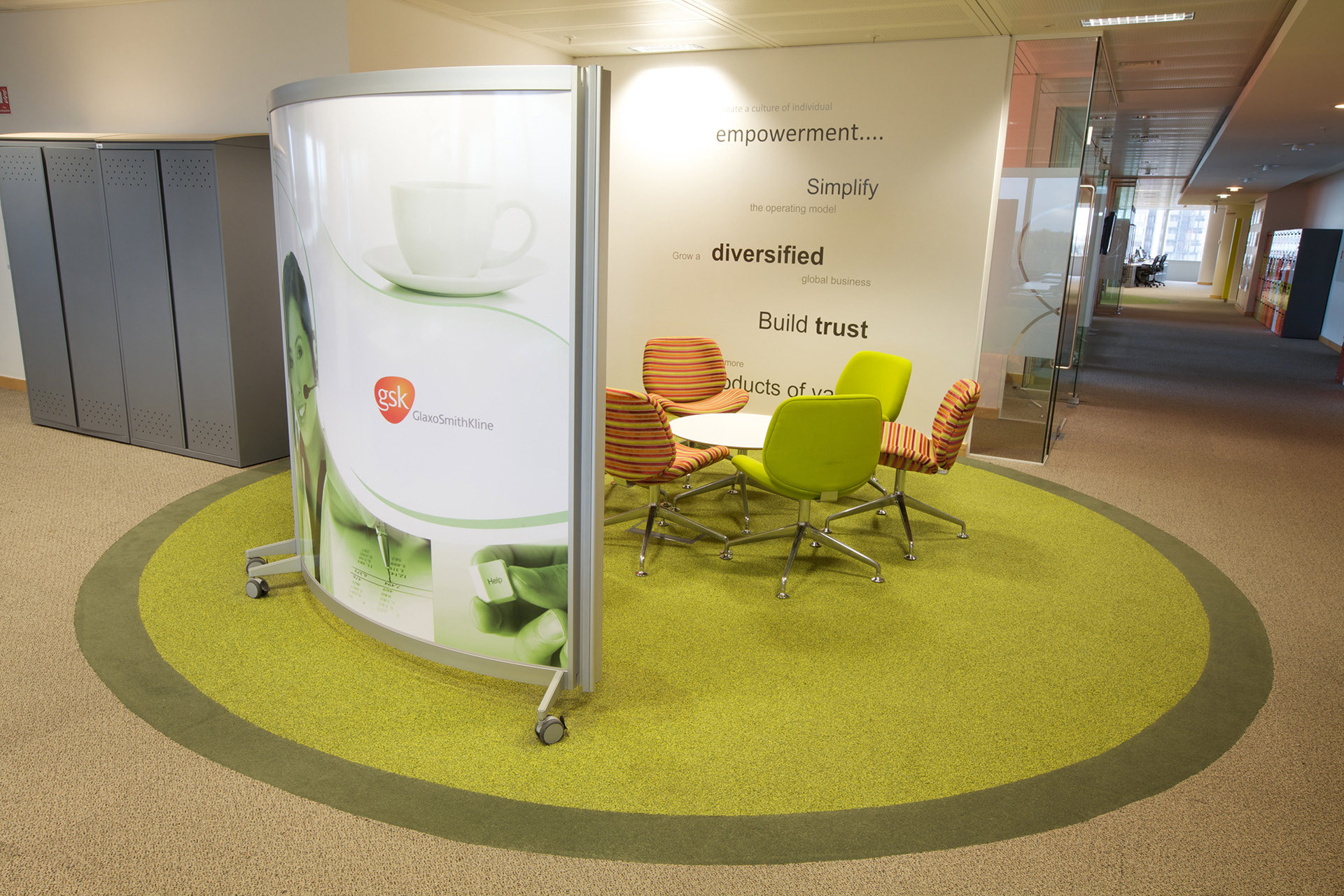
Inspiring words in meeting area and graphics applied to curved screen

Brand promotion graphic
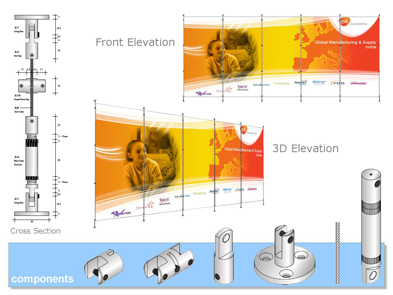
Design for how brand promotion graphic can be added to dividing panels
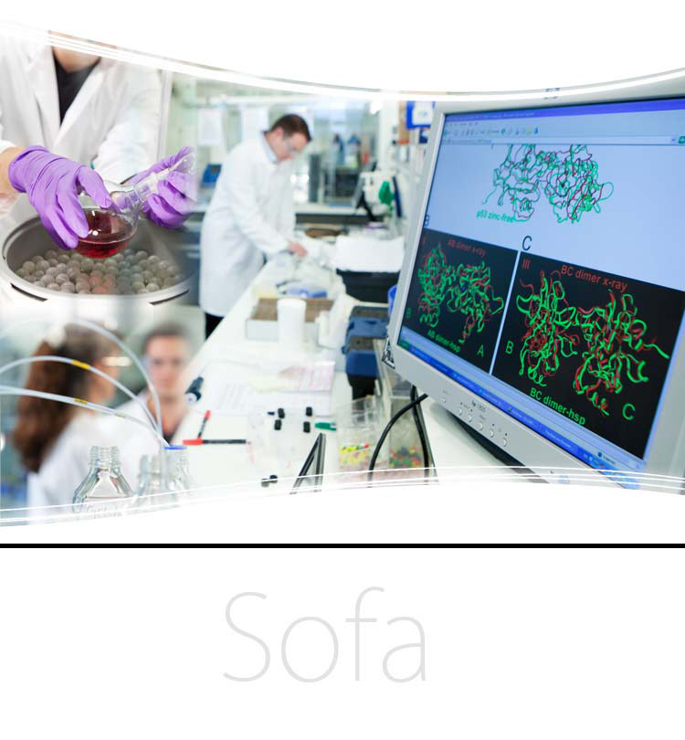
Designing graphics to allow for furniture
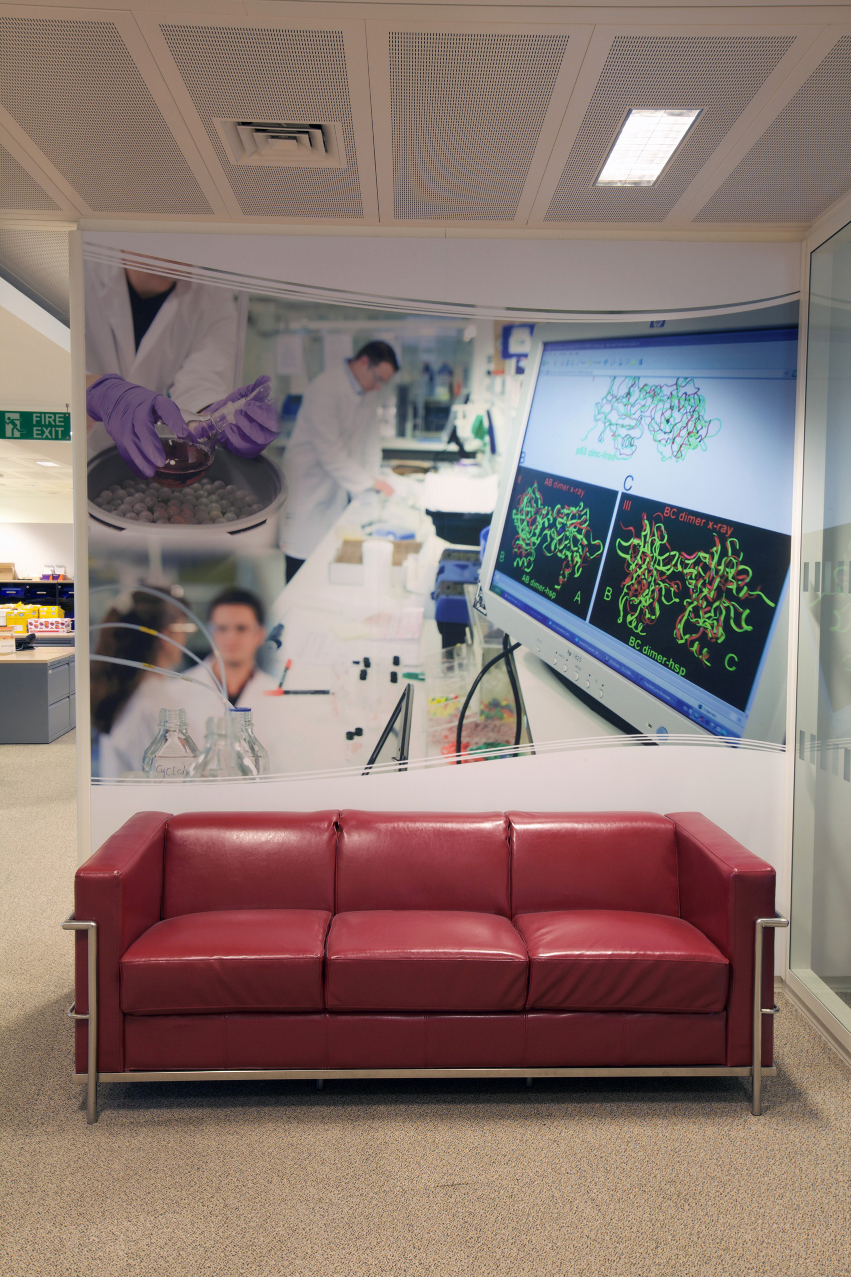
Designing graphics to allow for furniture
These are are just some of the many large wall graphics that I have designed for Glaxo Smith Kline's global headquarters. The wall graphics are used to reinforce the company mission and branding of the products they produce. They also help brighten up what would otherwise be a boring wall.
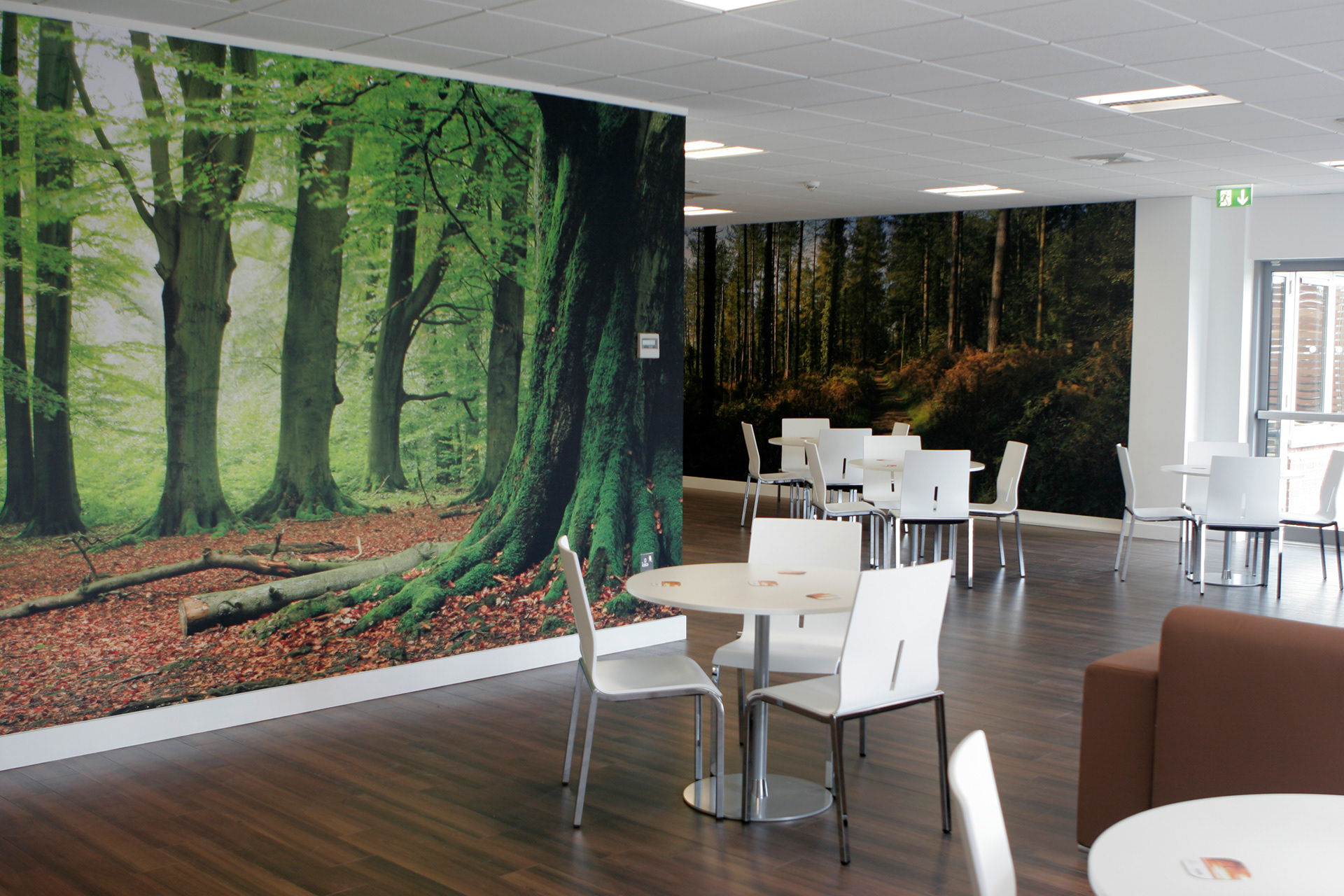
Woods wall graphic used in the dining space
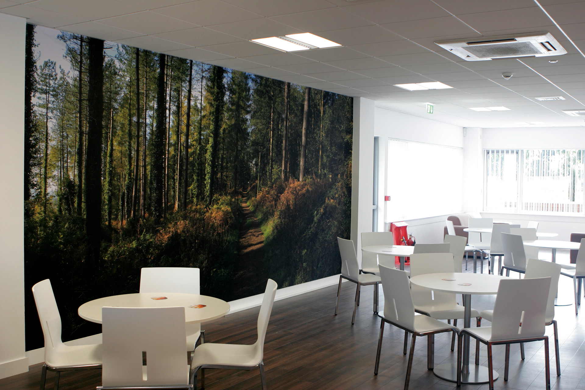
Woods wall graphic used in the dining space
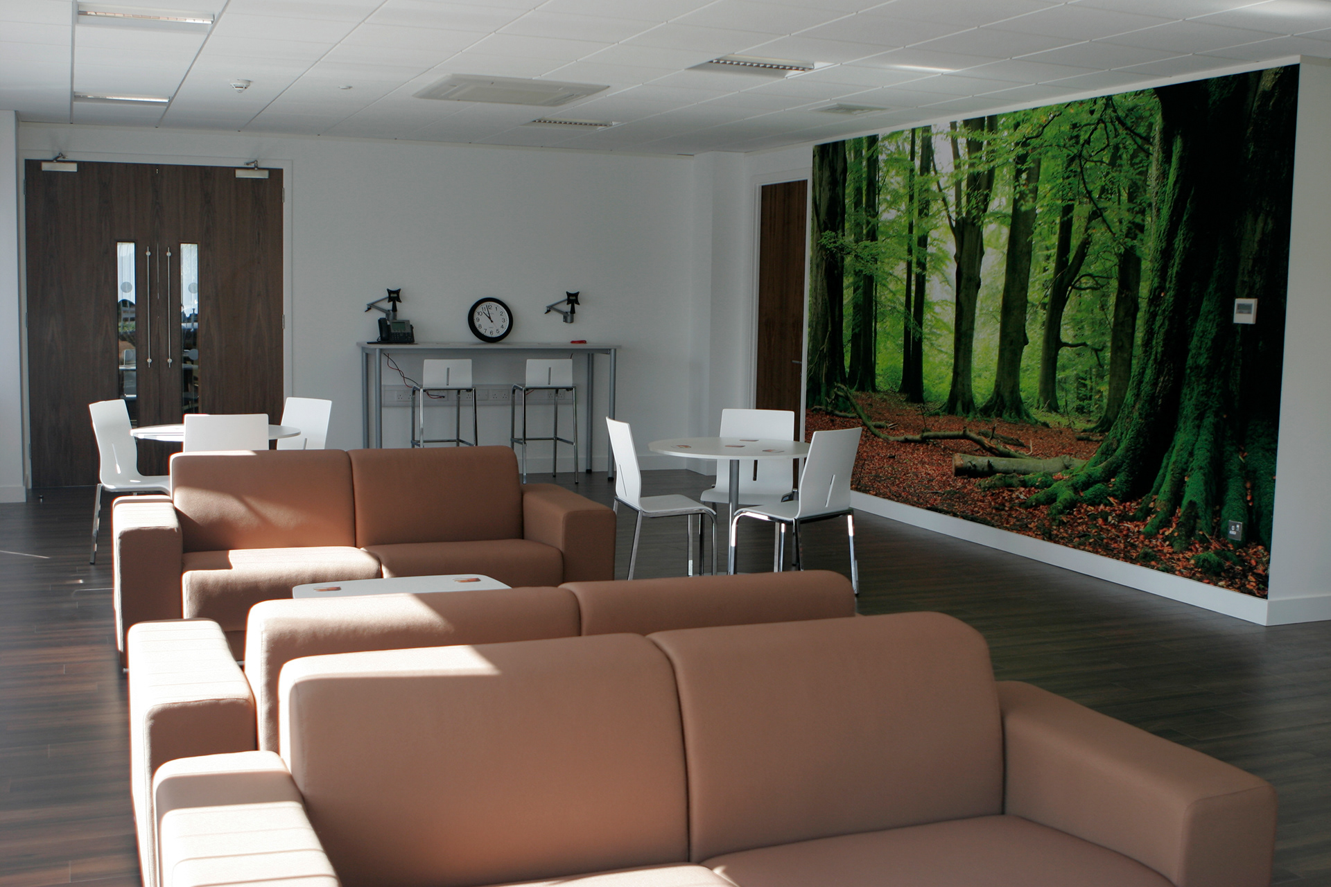
Woods wall graphic used in the dining space
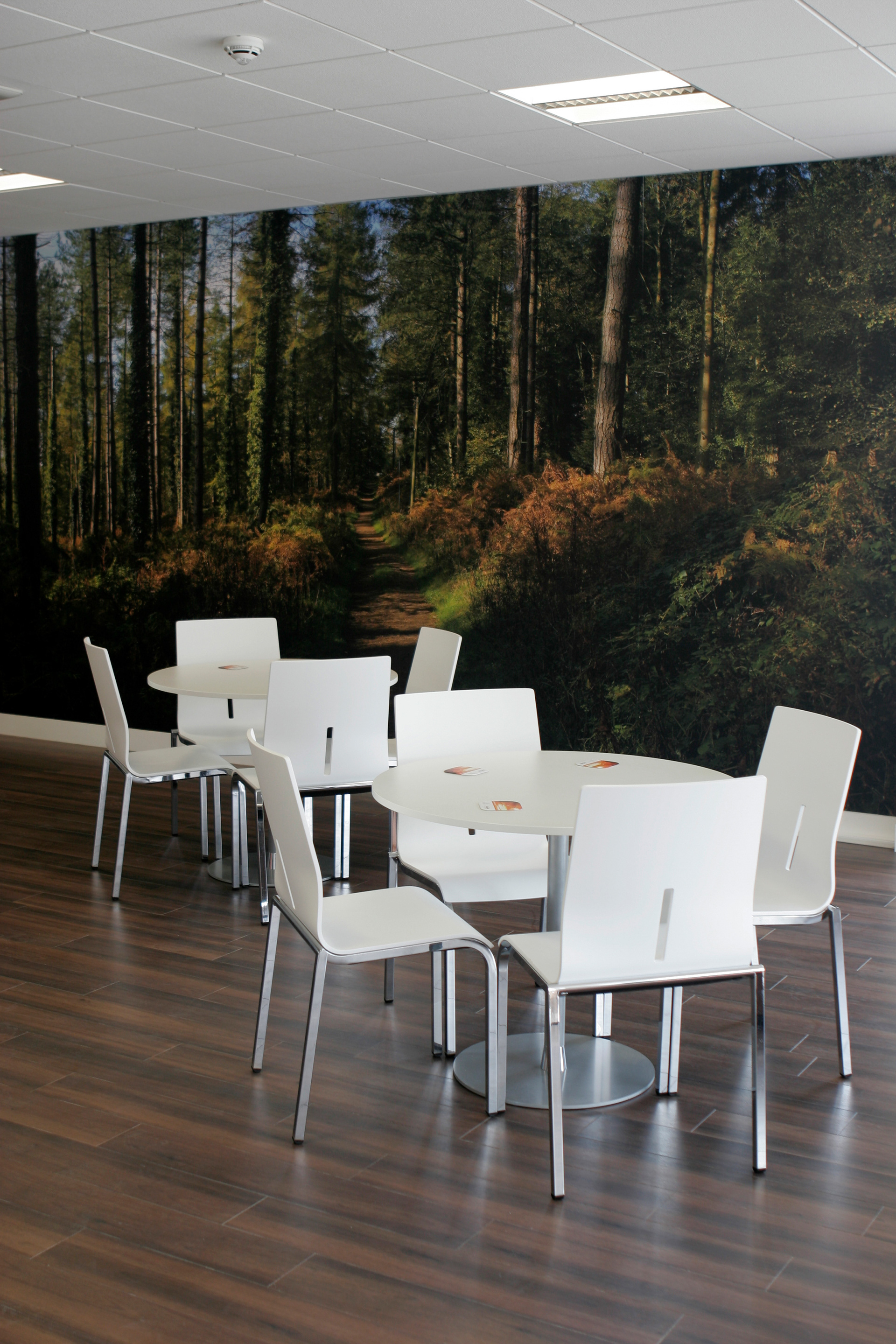
Woods wall graphic used in the dining space
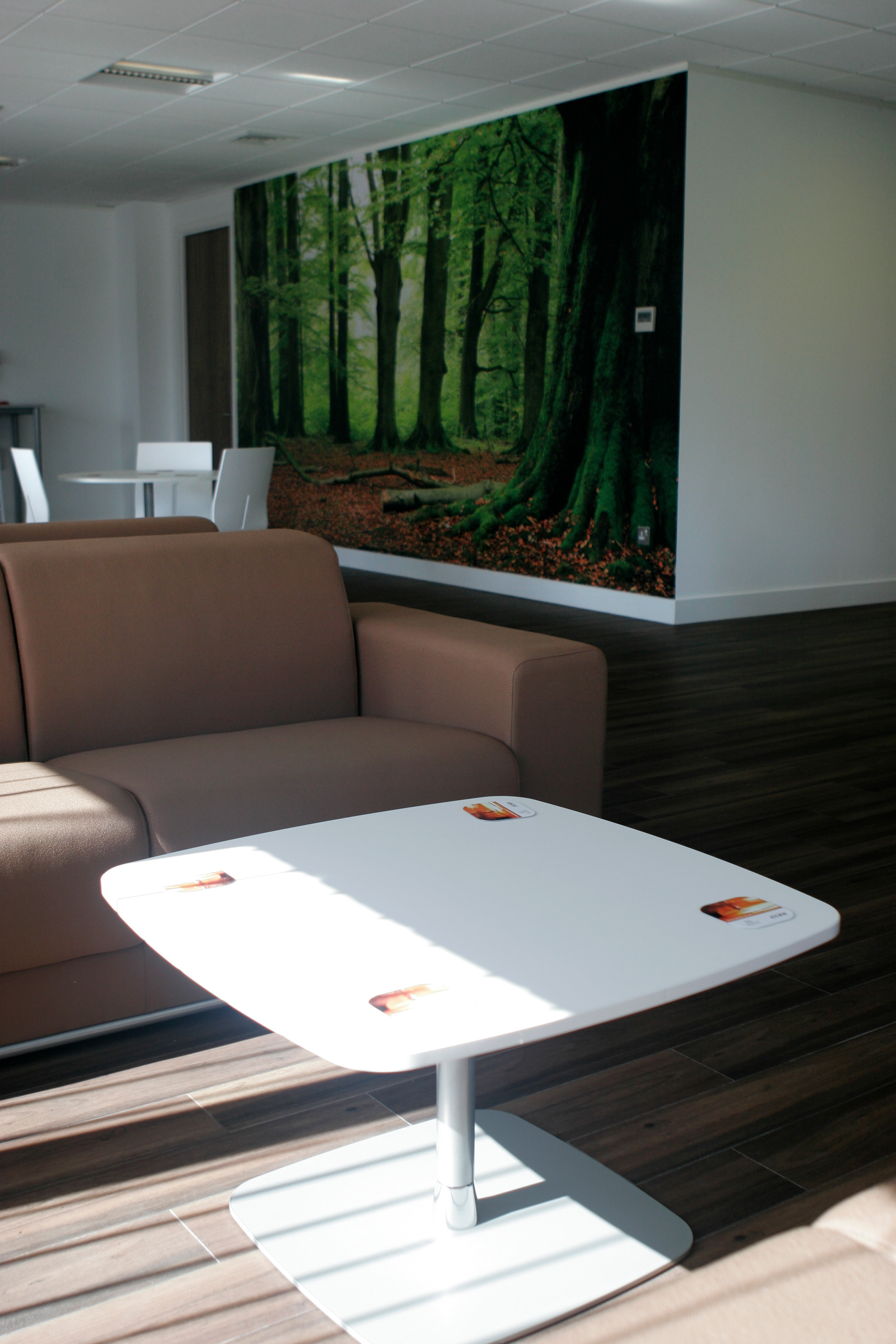
Woods wall graphic used in the dining space
Dicom used images of woods to create a calm place for staff to eat or take a break. The green of the wood images work well with the timber floor and white tables and chairs.
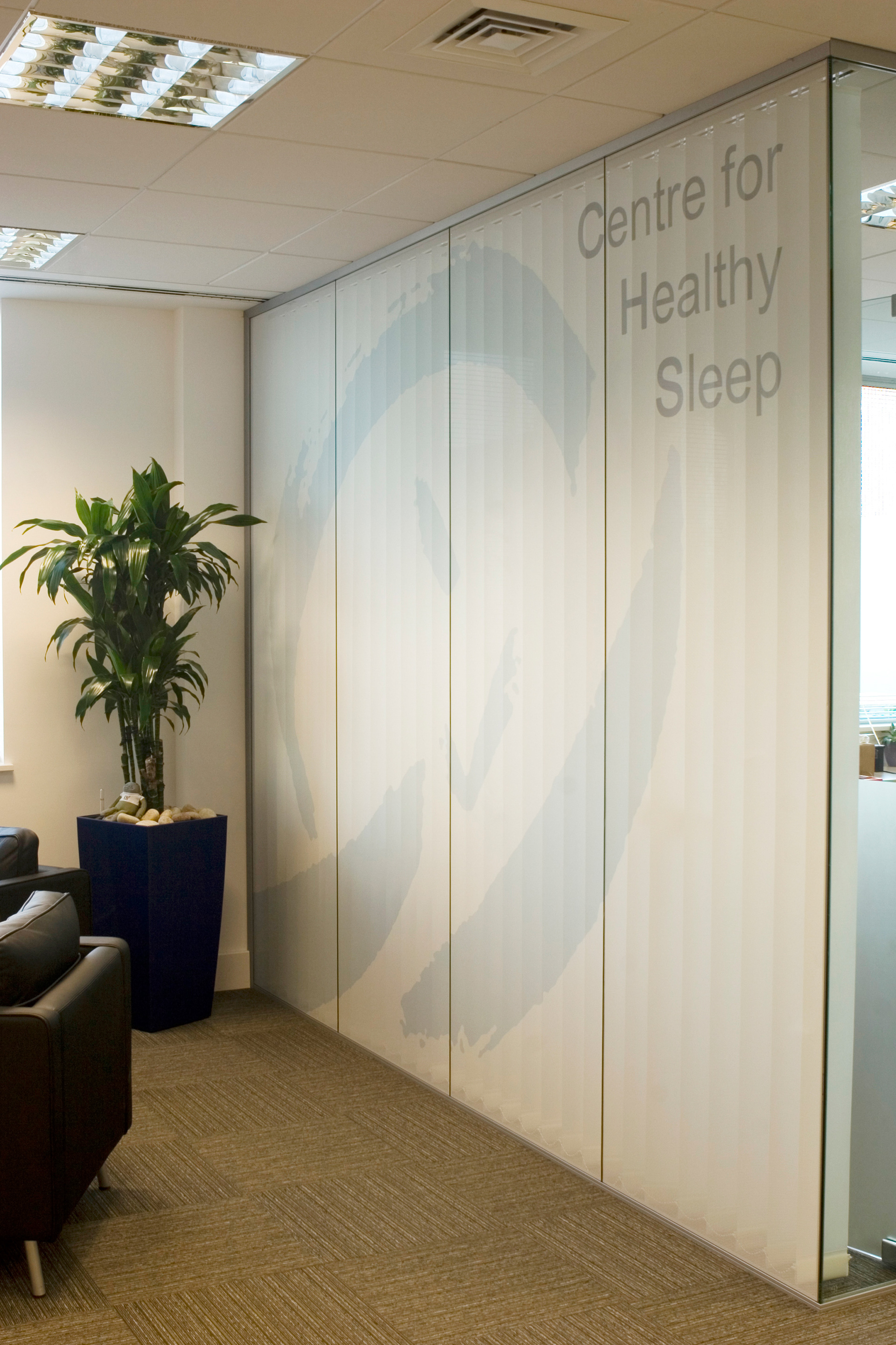
Reception branding
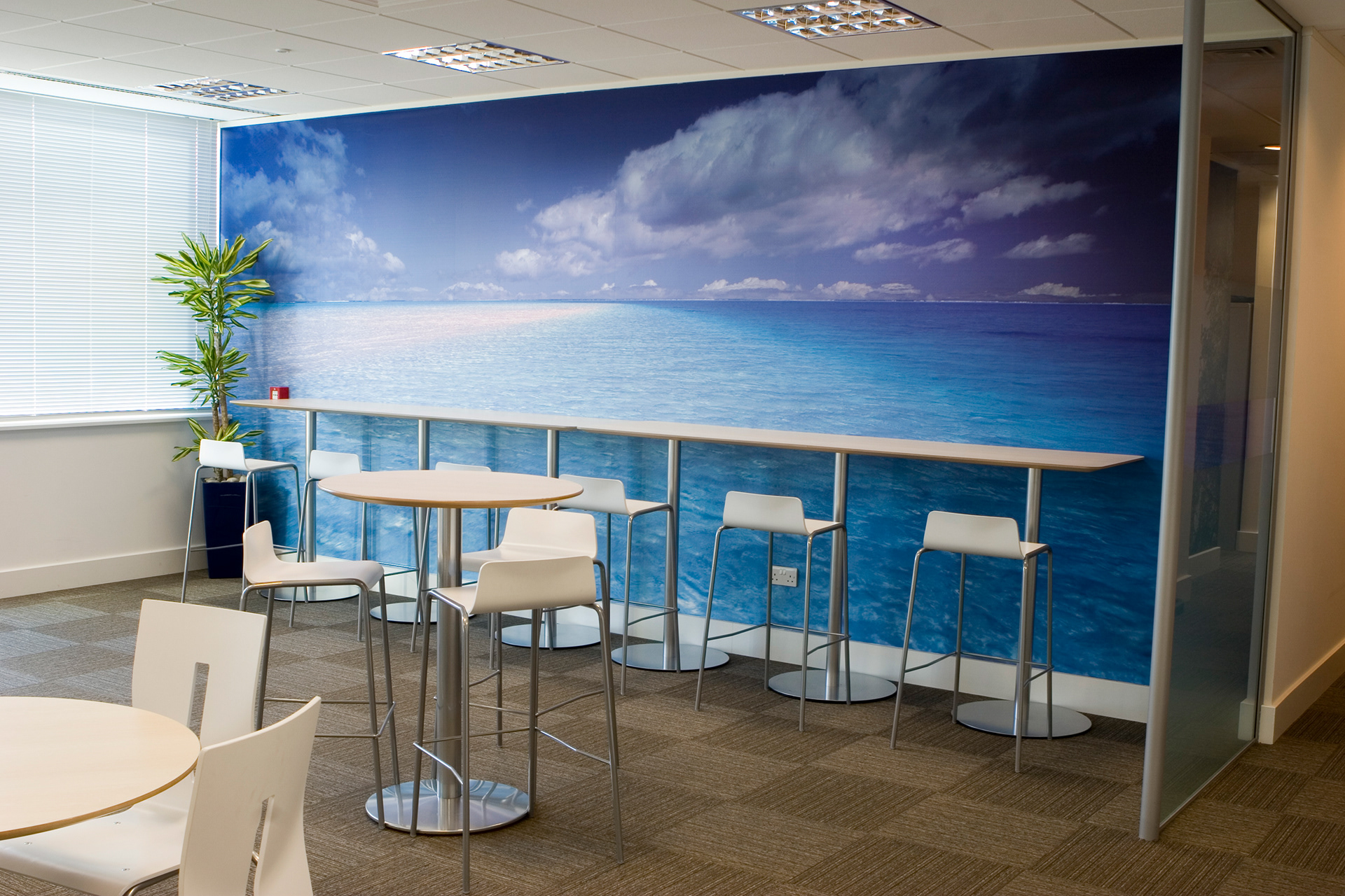
Breakout space wall graphic
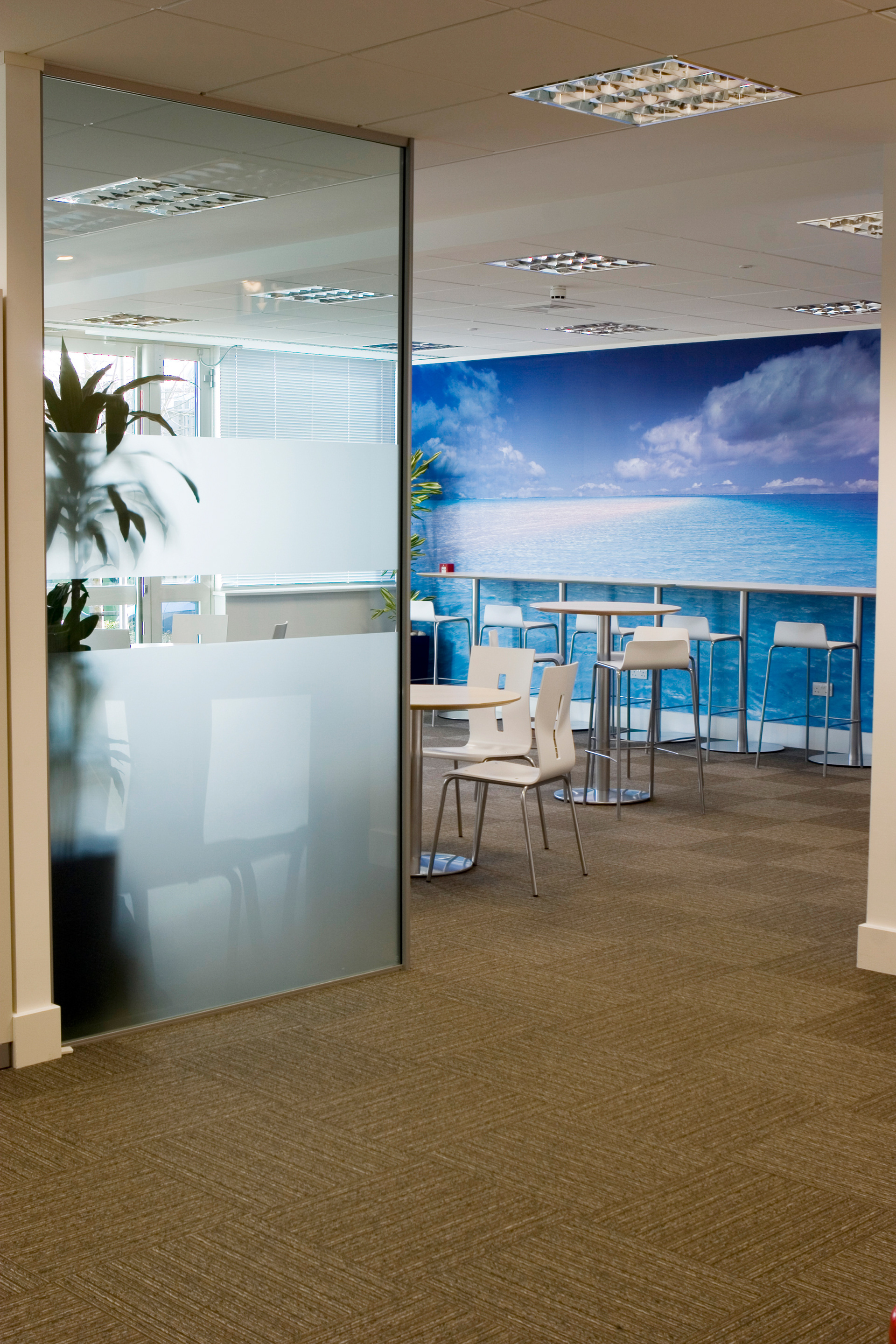
Breakout space wall graphic
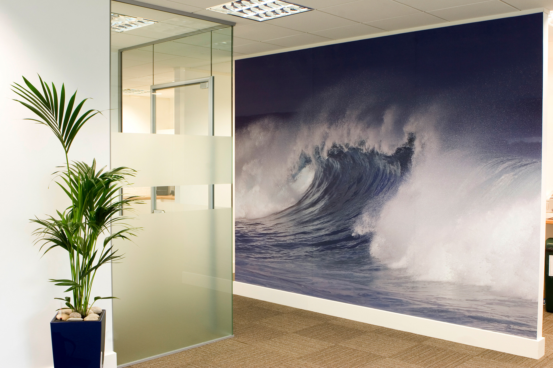
Print room wall graphic
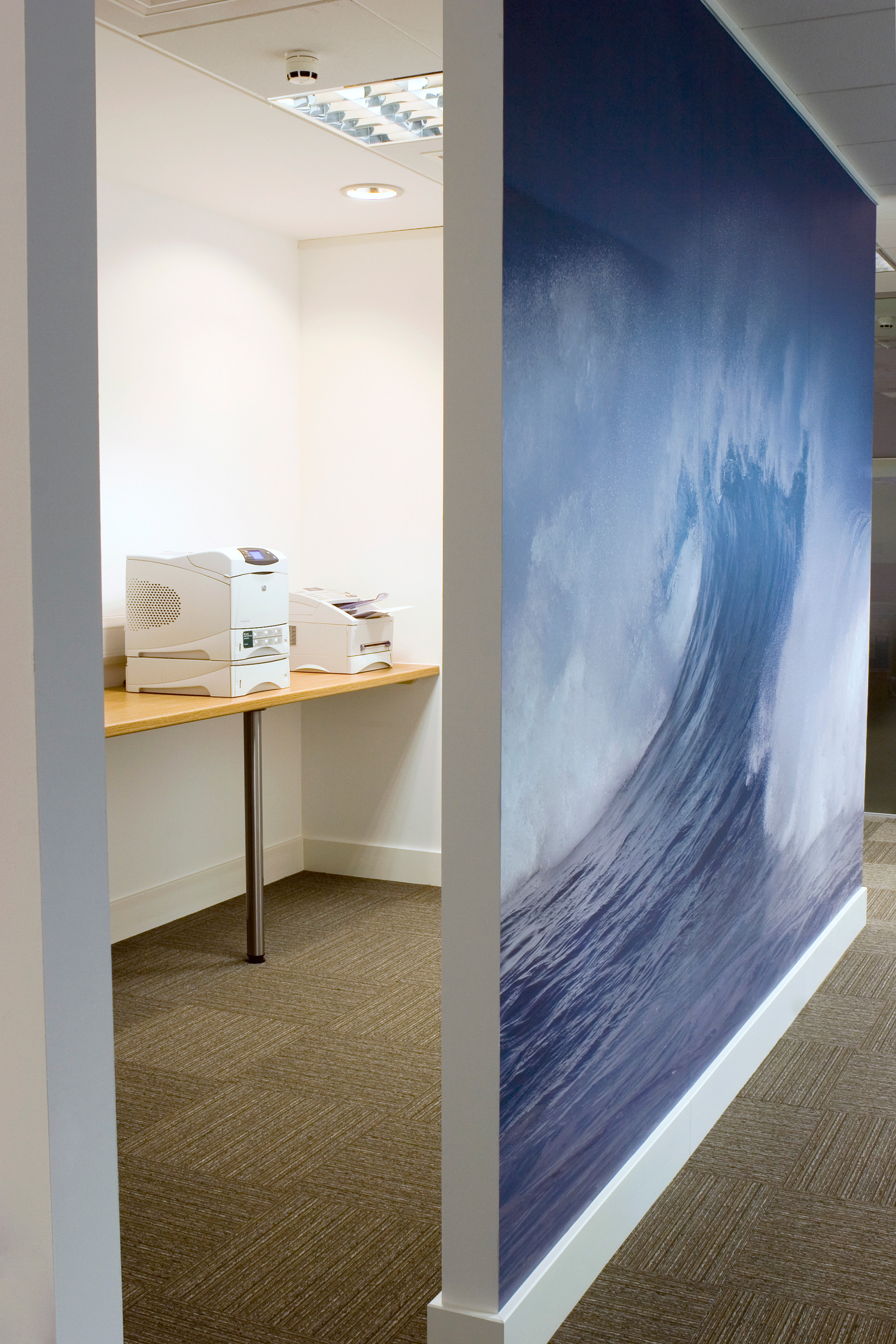
Print room wall graphic
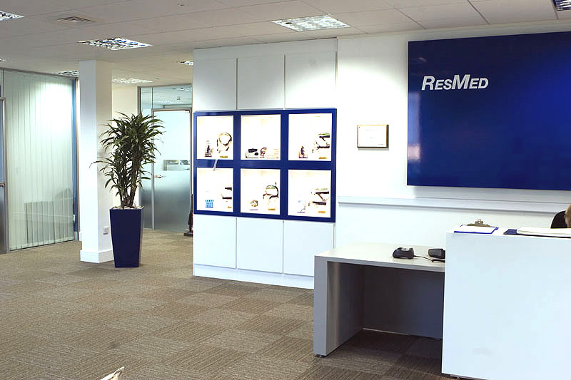
Reception branding
ResMed used large wall graphics to create a sense of calm in key work spaces. Sticking predominantly to a blue theme for the images helped keep alignment to their branding colour of blue.
